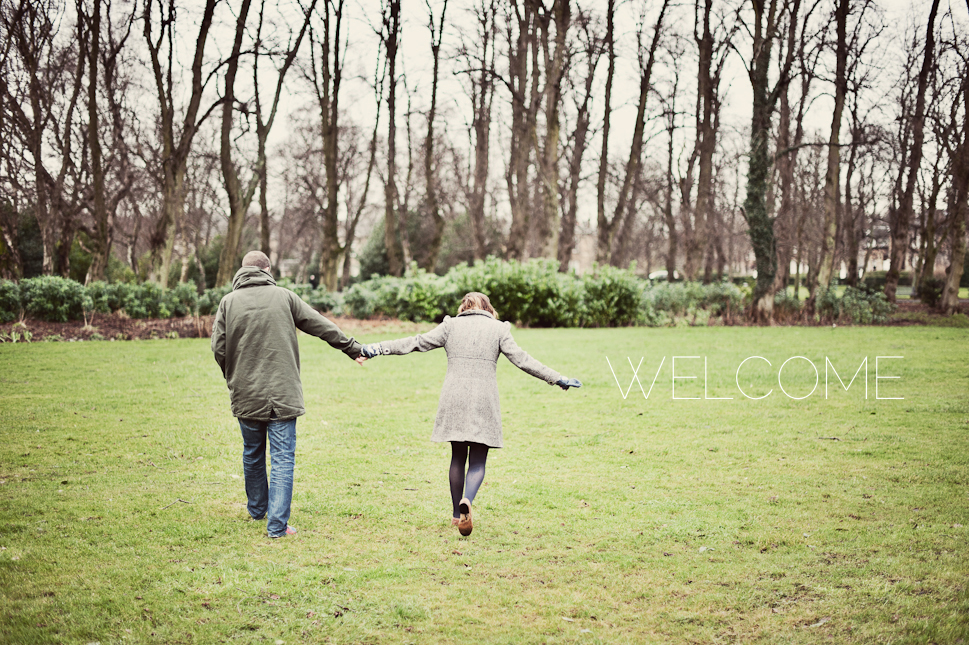
 So finally I am able to welcome you to my new re-jigged, re-crafted and majorly re-considered website.
‘This is what has taken you months” I hear you holler. Well, yes and…well, no.
I actually took my website down back in September (yes almost 5 months ago!) In the vain hope that I would whip up a new site in oh… ‘a couple of nights.’
What was I thinking. I was bang in the middle of one of my busiest months and there was no space in the diary until November for me to even consider spending time oggling fonts, designing icons, creating galleries.
The other website quickly got popped back up and I got on with things. I did manage to design my new logo though which clearly set the tone for how I wanted things to look and feel from now on. Clean, simple and minimal.
I want it to be all about my photographs. Hopefully my photographs give you a better sense of who I am and what makes me tick than a logo, icon or frilly border ever could.
So this is it.
It will most certainly evolve and develop. I get bored easily. But I hope you like it and appreciate that white backgrounds aren’t always just a cop out, simplicity can be complex… and heavily considered!
